Style Guide
v2.0.7
View Docs© 2025 Sprintfort. All rights reserved.

Morphe DesignBuild
2025
Branding
Visual Identity
Scroll
Morphe DesignBuild
2025
Branding
Visual Identity

Branding
Visual Identity
Logo Design
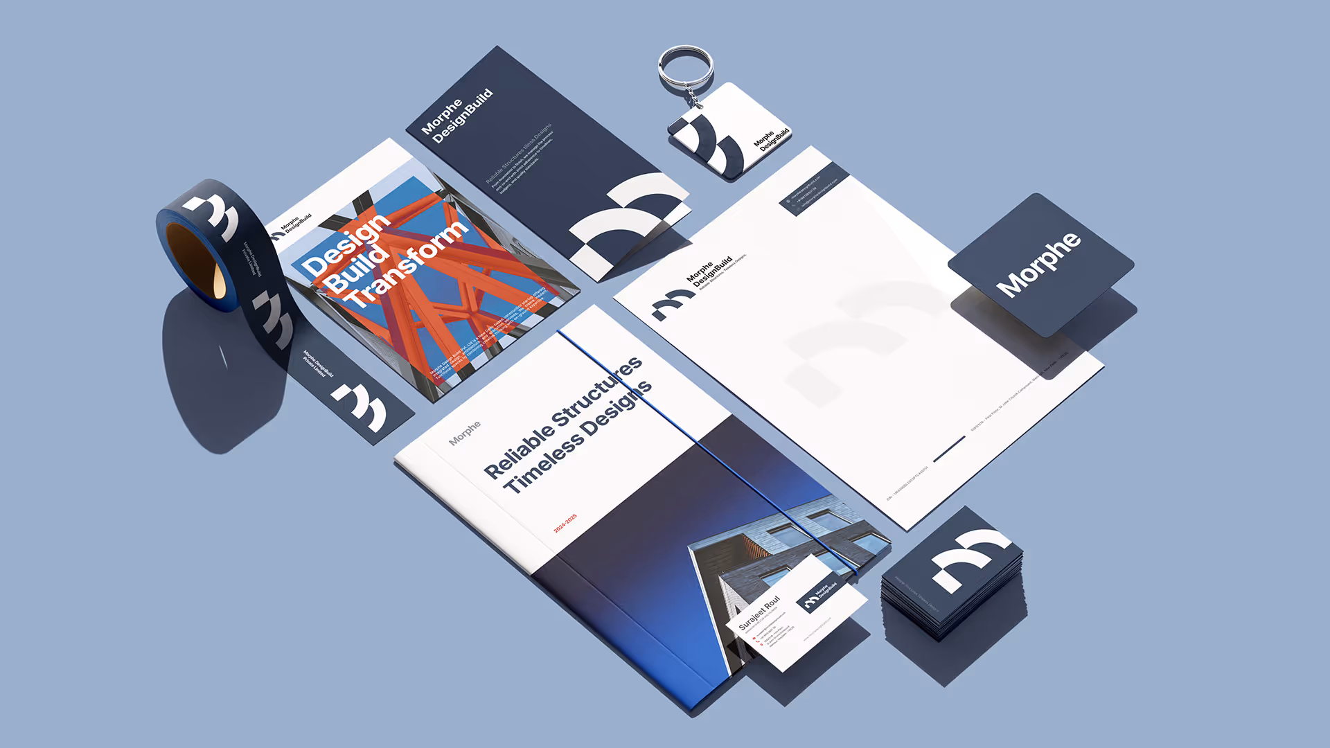
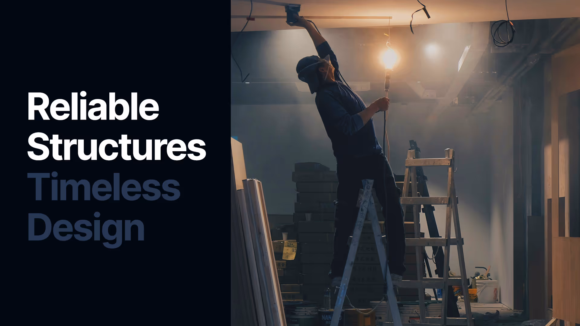
Morphe Design Build needed an identity that could reflect both their precision and their creative, forward-thinking approach in the field of construction. We began by exploring shapes and forms inspired by construction blocks and modular structures — a direct nod to the building process itself. The result was a bold, modern identity that communicates strength, trust, and innovation while remaining versatile enough to grow with the brand.
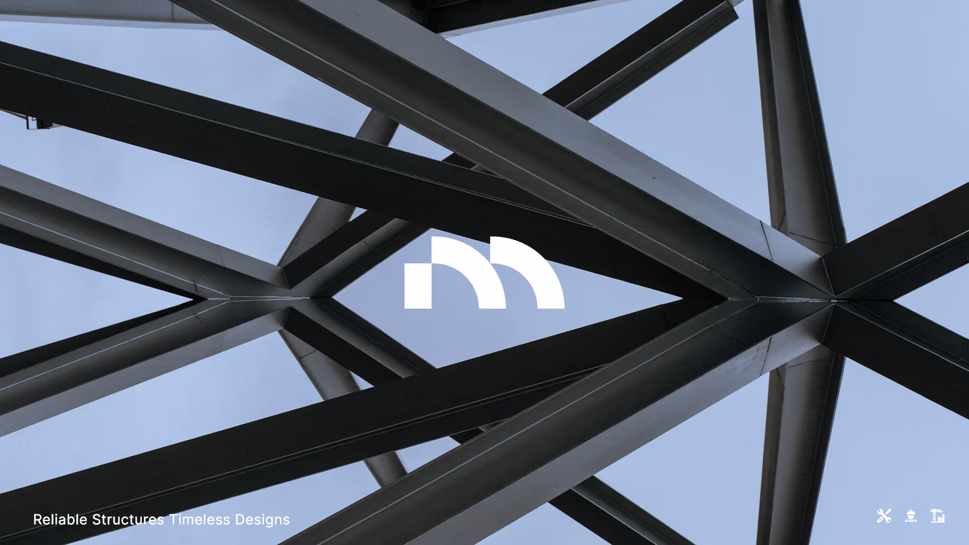
At the core of the identity is a logo inspired by architecture — columns and arches arranged to subtly form the letter M. This fusion of structure and symbolism captures Morphe’s essence: building with logic, form, and artistry. The mark feels strong and grounded, yet flexible enough to work across digital and print applications. Its simplicity ensures timelessness, while the hidden “M” adds a layer of discovery and memorability. We used Inter as the primary typeface, a modern sans serif with an extensive range of weights, giving the brand flexibility to adapt tone across headlines, subheadings, and body text.

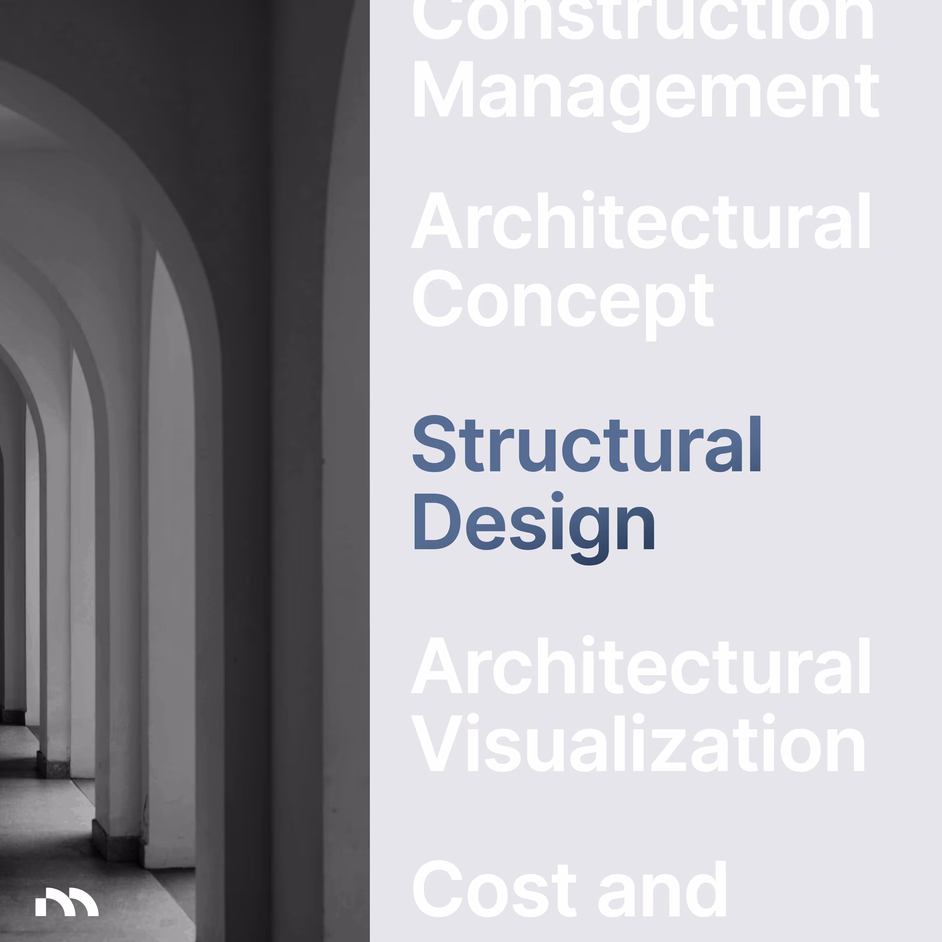


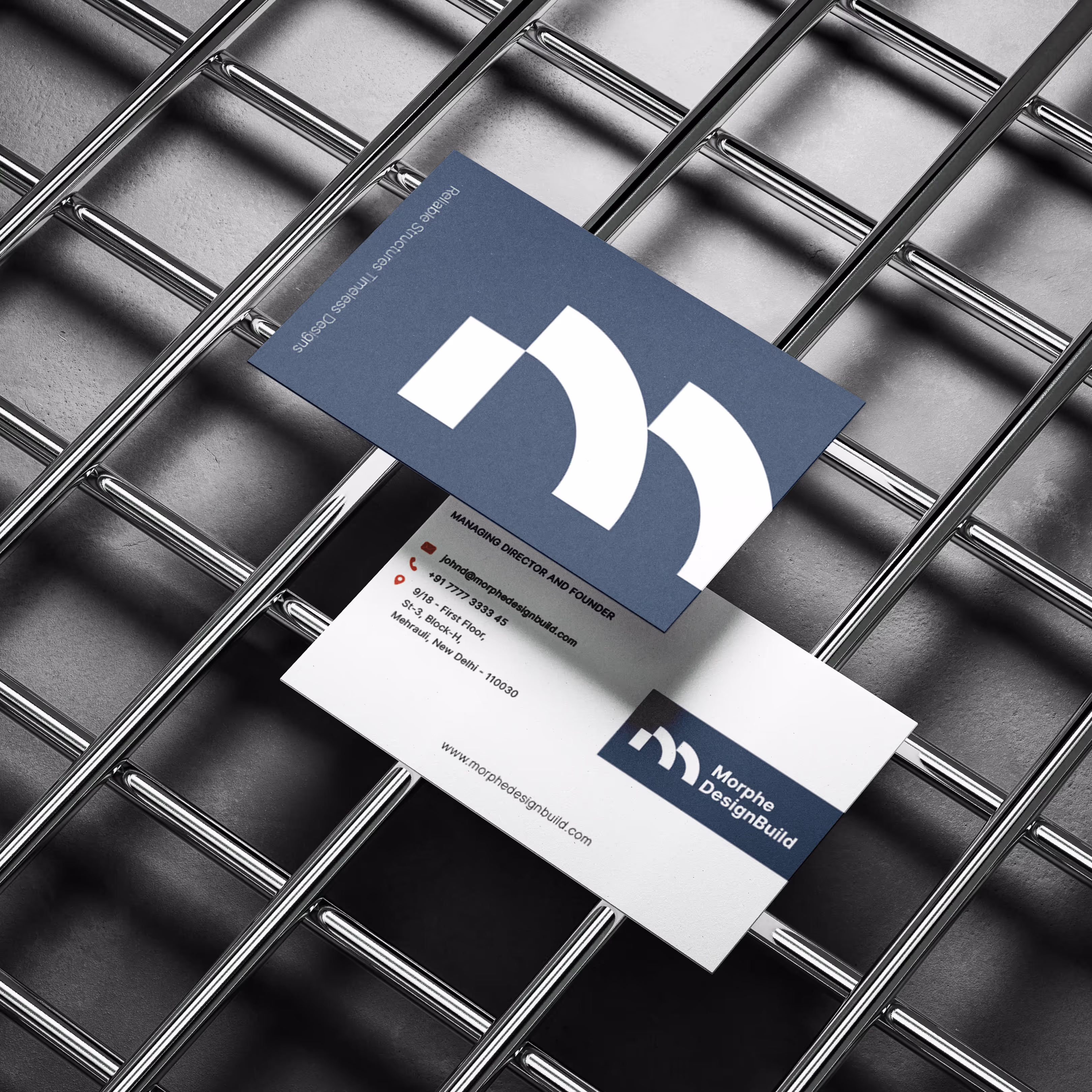
To bring this system to life, we extended the brand into practical applications, from digital collateral to presentation templates. Each piece was designed to maintain consistency while allowing flexibility, ensuring Morphe presents a strong and cohesive image in every interaction. This makes the brand not just visually appealing but also practical for everyday use.